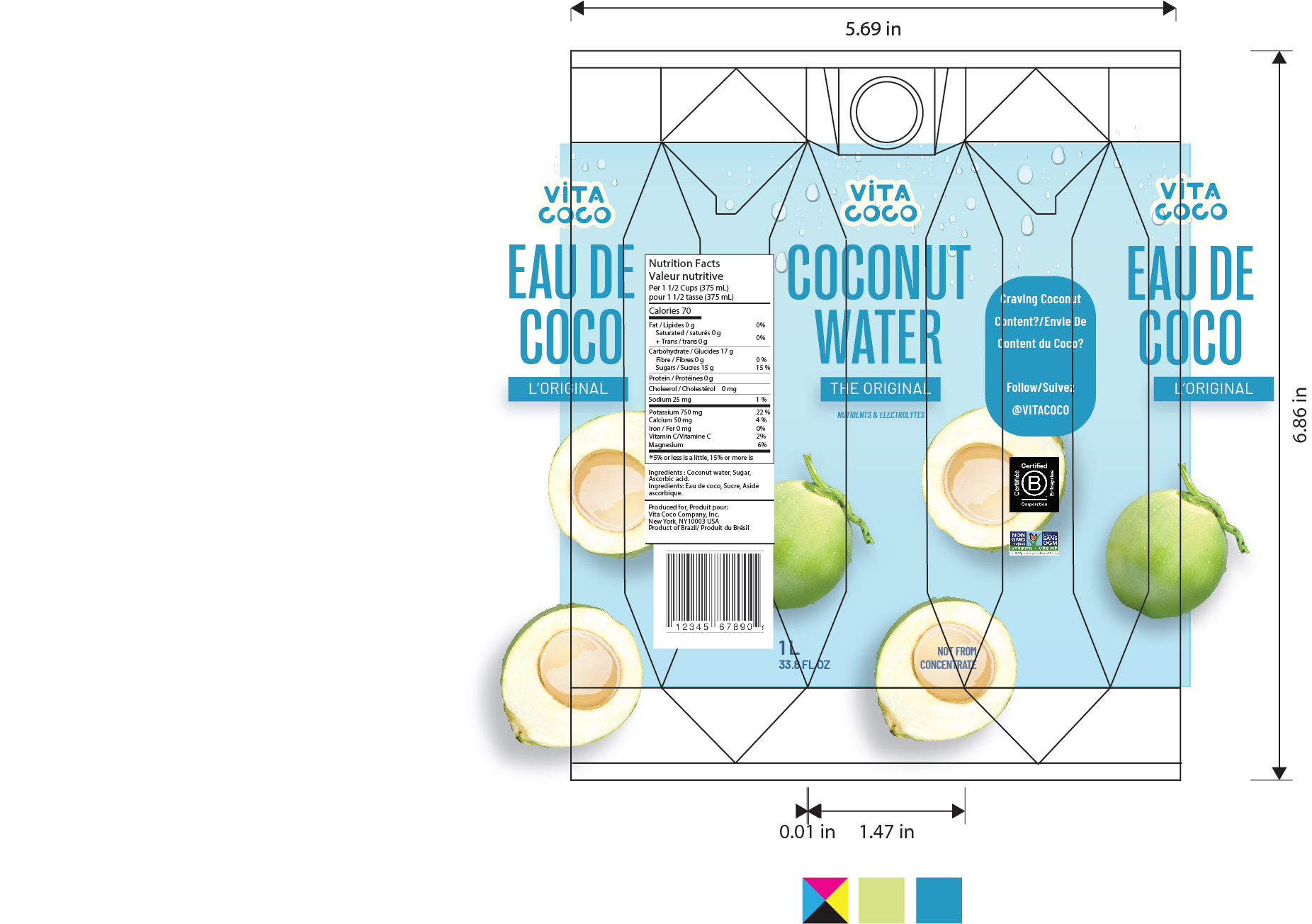
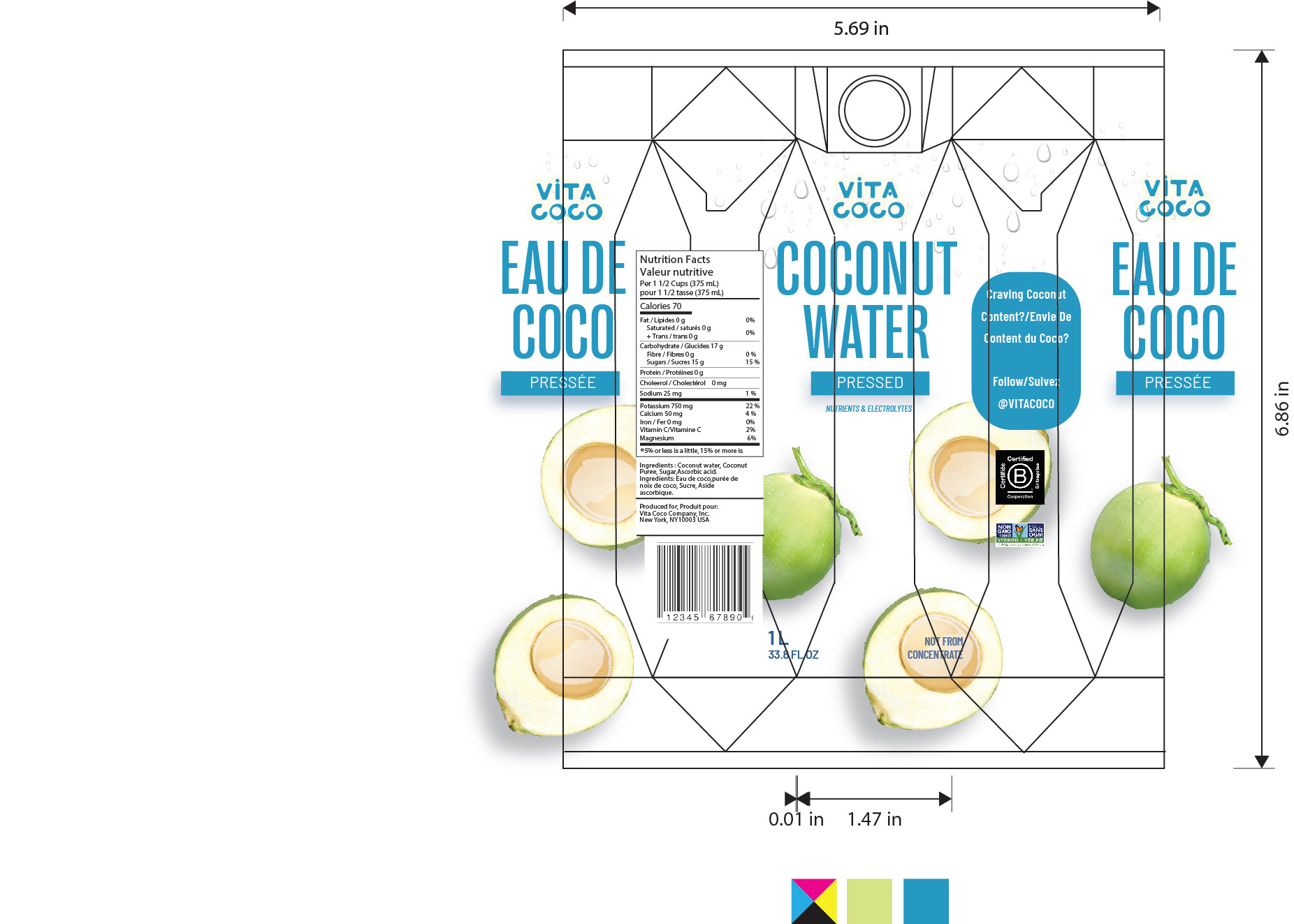
This project has been created with collaboration with Vietnamese designer Thuy Nguyen, for more of Thuy's work visit Thuy Nguyen
Vita Coco is an American beverage company which
mainly sells coconut water founded in 2004. The largest
brand globally in coconut/plant waters, Vita Coco has
operations in 31 countries as of 2016.
mainly sells coconut water founded in 2004. The largest
brand globally in coconut/plant waters, Vita Coco has
operations in 31 countries as of 2016.
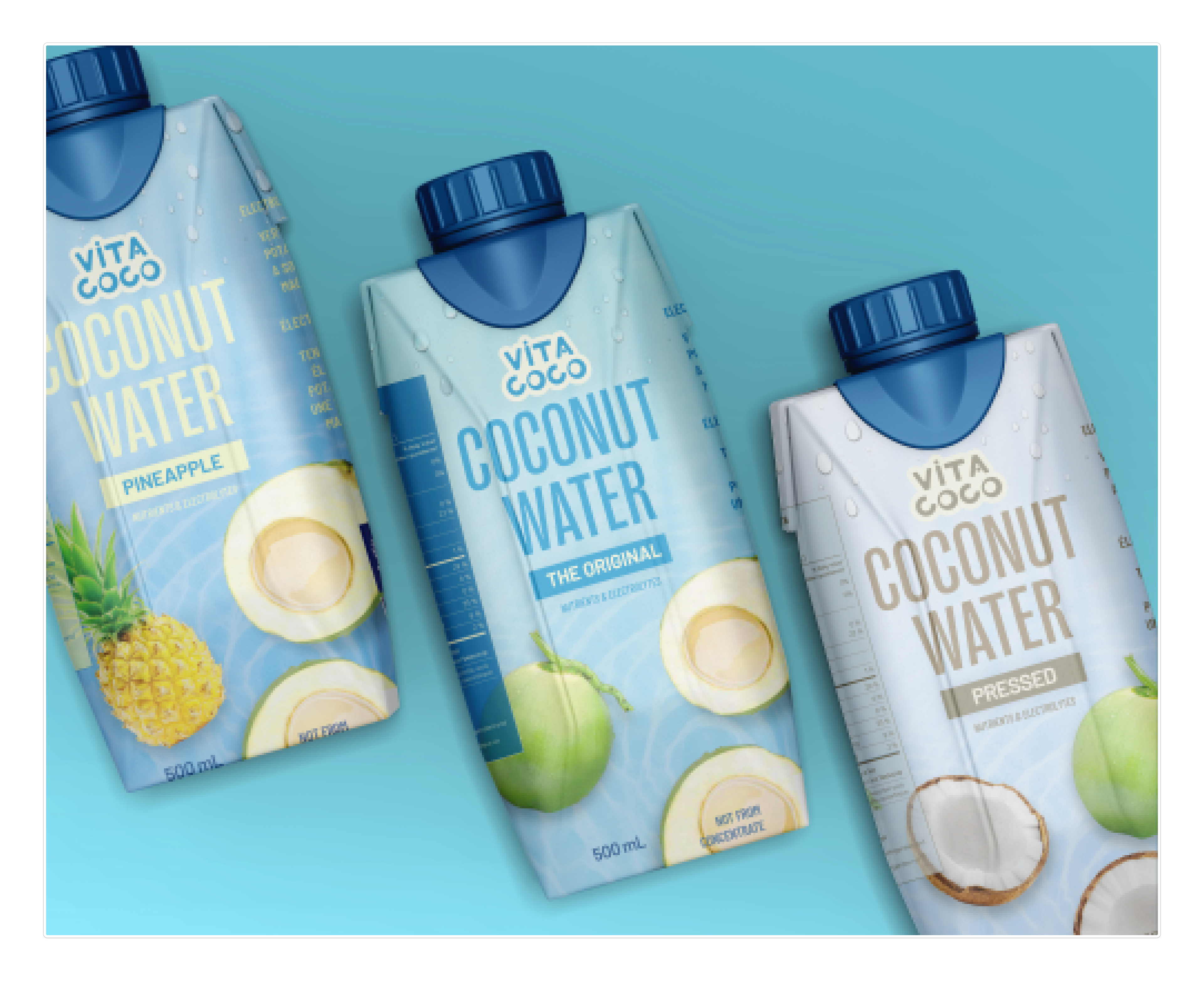
Vita Coco's original logo and packaging
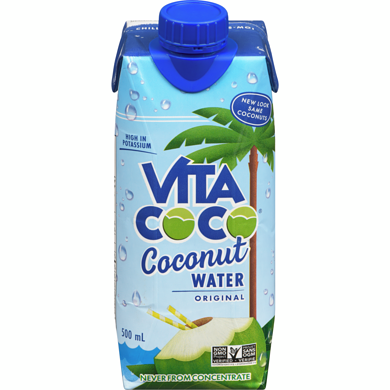
When researching the brand, we realized the logo of Vita Coco
is might too youthful, and has too much orientation on youth.
The coco illustration from 2 letters “O” makes it look unrelated
to the original target audiences (health-conscious consumers,
athletes, and those seeking hydration alternatives). Therefore,
we decided to redesign the logo with simplified versions
New logo idea
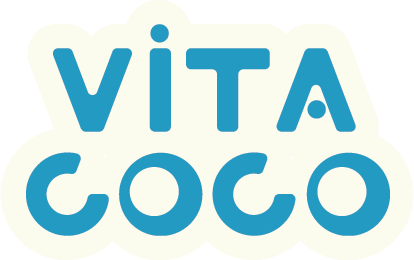
Retain the bold and rigid elements of the old logo but simplify details:
• The coconut motif and the asymmetrical V shape -> resulting in a
simple, mature concept.
• The bold and straight font gives off a strong, energetic vibe ->
suitable for the target audience (athletes).
• The stylized detail in the letter A creates a sense of connection with
the motif in the letter I.
• The letter O is stylized from the image of a coconut, but in a simpler
form.
• The edges are rounded with a fixed size to ensure the logo doesn’t
appear too rigid or unapproachable, keeping it fresh and friendly to
customers